Film industry giants usually use wordmark logos to represent their companies. That’s what Marvel has done with it. However, this logo has gone through several phases. This means that it wasn’t the same as it is today.
So, we’re going to take an overview of Marvel Logo history in today’s article. We will see what phases it went through and what it looked like. It will help you know how the iconic design that shaped pop culture was made. Let’s start.
Overview of the Marvel Company
Marvel is one of the biggest American comic companies. It is known for designing and publishing superhero comics. Besides this, it has now become a pillar of the modern cinema. That is because it produces different movies and TV series based on their comics.
The company has also made several games. They, too, revolve around their superheroes. The nature of the company is very interesting. That is because both children and adults love its work. It goes for both comics and entertainment media.
Marvel Logo History:
The details of this history are given below:
1939-1993:
Timely Comics:
Marvel didn’t start as Marvel. It was called Timely Comics (in 1939) at the time of its introduction. The interesting thing is that it had a wordmark log back then as well. When you look at its first logo, it reminds you of Captain America. That is because it has a similar color scheme.
The logo consists of blue and red colors. A medieval shield separates the logo words.

Atlas Comics:
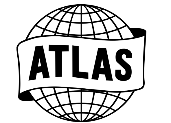
Businesses go through several phases. So, did Marvel. Later in 1951, it was called Atlas Comics. And the logo had to be changed. This time, an even simpler choice was made. The logo of this company was a simple globe. It had an inscription band encircling it. The word “Atlas” was written on it. This logo looks a bit dull when you observe it.
Marvel Comics:
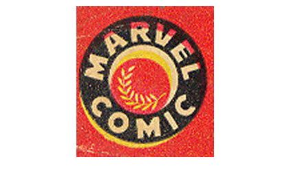
The first time this company used the name “Marvel Comics” was in ’57. It was the time when legendary Stan Lee started writing comics for them. The logo they adopted was circular. It had a red background and the circle was black. “Marvel Comics” was written on it in yellow color. It doesn’t give a very modern look.
Copying DC:
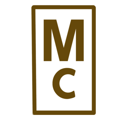
DC is another comic company that is a major rival of Marvel. So, they decided to copy them. Marvel adopted a similar logo as theirs. It had only two letters written on it (M and C). They were written above one another in a box.
Marvel Comics Group:
Later, the company had a huge breakthrough in their comics. They released several of them including The Amazing Spiderman and The Incredible Hulk. They became a lot famous and the company decided to change their name again. Now, it was called the “Marvel Comics Group.” The logo was changed as well. It was a simple wordmark that remained for several upcoming years.
1993-1996:
Comics:
The comics logo that was adopted by the company in ’93 was similar to the MTV logo. It has a big red “M” in the middle. Above it, the word “Marvel” is written. In the middle of the logo, the word “Comics” is written diagonally. The whole logo is red except for the ‘comics’ word.
Films:
For films, they used a similar logo. Except, it used a metal-type look. The “M” is written like a film reel. The word “Marvel” has the same place. And “Films” replaces “Comics”. The logo has a blackish color but the word “Films” is red.
1996:
This year, the company decided to keep the metallic film logo. However, they changed the name to “Marvel Studios”. The complete logo remained the same. It just replaced the word “Films” with “Studios.”
2002:
Now, Marvel started shaping a logo that is very close to the current one. It’s a very simple log. That is because only the word “Marvel” is written in white with a red background. The letters are all capitalized. They are attached to each other except for the last one (L).
2008:
Now, Marvel again added the word “Studios” in it. This time, it was written in very small letters below the main word. It is bordered by two horizontal parallel lines. The trademark letters are also included at the top right corner of the word “Marvel”. This logo is also red and the letters and lines are white.
2013:
Now, the logo has been changed to make it simpler. The company did it by removing the red background from the word “Studios”. The lines are also removed and its fonts are now black. They also ditched the trademark sign. This game gives the logo a very modern look.
2016:
This is the current Marvel logo. It has been the same so far. There is no authentic information available about whether or not they’re going to replace it.
The new logo took the word “Studios” from below to in front of “Marvel”. It’s written in black and the horizontal lines are back. However, they only border the second word of the logo. The first word remains the same.

Final Verdicts
Marvel Logo has gone through different phases throughout history. The company changed its name in several earlier years. So, the logo was changed as well. It experimented with it in different ways. The company even tried to copy the style of its rivals as well. After starting the production of films, another wave of changing logos came. It remained till 2016 when the latest Marvel log was released.
Frequently Asked Questions (FAQs)
Will the Marvel logo change again?
There is no information provided by the company about the change in logo so far.
Which Marvel logo is the most famous?
The current logo can be considered the most popular logo around the world.
Who designed the first logo of this company?
The company’s first logo was designed by Martin Goodman.


