Key Takeaways
- Consistency is critical – mismatched icons break visual language and user trust across products.
- Icons8 solves the problem by acting as managed infrastructure, not a marketplace of random uploads.
- Real-world workflows benefit – designers switch styles for cross-platform apps, developers get clean SVGs or Lottie animations, and content creators recolor icons instantly.
- Better than alternatives – unlike open-source packs (limited scope) or aggregators (inconsistent styles), Icons8 delivers scale and cohesion without the cost of in-house design.
Building a cohesive user interface often crashes when you hit the icon layer. You might find a perfect “home” icon in one open-source pack, but the “settings” icon in that same set looks slightly off. Or it doesn’t exist at all.
Designers end up mixing and matching sets to fill the gaps. The result is a fragmented visual language where line weights, corner radii, and perspectives clash.
Growing product teams face a difficult question: How do you maintain a consistent visual language across an ecosystem without hiring a dedicated team just to draw glyphs?
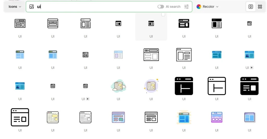
Icons8 Icons solves this by operating as a centrally managed infrastructure rather than a marketplace of disconnected uploads. The library holds over 1.4 million icons, but the volume isn’t the main selling point. Depth is.
Select a specific aesthetic-say, “Windows 11 Color”-and you aren’t limited to a few hundred common symbols. You get access to over 17,000 icons drawn to those exact guidelines.
In this blog post, I will explain how this icons library works in real-world workflows, from design to code.

How Icons8 Help? Real‑World Scenarios
The Multi-Platform Product Designer
Take a UI designer tasked with creating a mobile application. It needs to feel native on both iOS and Android devices. Stakeholders want the app to respect the design guidelines of each operating system while maintaining the brand’s core identity.
With a typical icon aggregator, the designer hunts for two distinct sets. They have to hope both sets cover all necessary metaphors-user, cart, hamburger menu, analytics-without missing edge cases.
Icons8 shifts this workflow to style selection.
Grab the Figma plugin to access the library directly within the canvas. For the Apple version, select the “iOS 17” style. This pack alone contains over 30,000 icons in Outlined, Filled, and Glyph variants. Every asset pulled into the design adheres to Apple’s specific stroke width and curvature rules.
When the Android ticket arrives, there is no need to redraw assets. Switch the library filter to “Material Outlined” or “Material Two Tone.”
Because Icons8 maps metaphors across styles, you can find the exact same symbols-a shopping cart or a notification bell-redrawn to match Google’s Material Design specs. The app feels native to the device. The designer avoids spending weeks vectorizing distinct assets for each platform.
The Frontend Developer Handoff
Handoffs are where design intent often breaks down. Designers frequently deliver SVGs that are messy, full of unnecessary groups, or incompatible with specific codebases.
Developers working with Icons8 approach implementation differently.
Suppose a design calls for an animated interaction, like a “success” checkmark that draws itself when a payment processes. The developer doesn’t need to ask the designer to open After Effects. They browse the “Animated Icons” category, which hosts over 4,500 assets.
Once the right animation is found, export options vary by use case. For a mobile app or modern web project, download the Lottie JSON file. It’s lightweight and scales infinitely without pixelation. For a simple landing page, a GIF might suffice.
For static icons, the “Simplified SVG” option is a lifesaver. Standard SVGs often contain complex paths that are hard to style via CSS. The simplified option merges paths and cleans up the code, making the icon ready for direct embedding into HTML or React components.
Need a quick prototype? Grab the Base64 code or a CDN link directly from the interface and bypass the file download entirely.
The Content Creator Workflow
Renne is a content manager for a mid-sized SaaS company. She needs to assemble a slide deck for a quarterly review and update a feature announcement on the company blog. She isn’t a vector artist, but she knows mismatched clip art looks amateur.
She opens Pichon, the Icons8 Mac app sitting in her menu bar.
First up: an icon to represent “strategy” for her Keynote presentation. She types “strategy” into the search bar. Results show chess pieces, maps, and flowcharts. She filters by the “Fluency” style to match the 3D look of her presentation template.
She finds a knight chess piece, but it’s purple. Her slide background is dark; she needs bright yellow. Right inside the app, she clicks the color wheel, pastes her company’s brand hex code, and the icon updates instantly. She drags the PNG directly from the app onto her slide.
Next, she needs a heart icon for a “Customer Love” section on the blog. She wants something friendly, not corporate. She switches to the “Hand Drawn” style in the web interface.
She finds the heart but notices a gap in the outline she dislikes. She clicks “Edit,” adds a small background circle to give it weight, and adjusts the padding. Satisfied, she downloads the 100px PNG for free (crediting Icons8 in the footer) and uploads it to the CMS.
Total time elapsed: less than ten minutes.
Comparing Icons8 with Alternatives
To see where Icons8 fits, look at the other options available to teams.
Vs. Open Source (Feather, Heroicons, FontAwesome)
Open-source packs are developer-friendly and usually free. They are lightweight and clean. But they are severely limited in scope. Most contain 200 to 2,000 icons. Need a specific icon for “bio-hazard” or “crypto-wallet”? You often hit a dead end. You have to draw it yourself, breaking consistency. Platform’s 1.4 million count eliminates the “missing icon” problem.
Vs. Aggregators (Flaticon, Noun Project)
Aggregators function as marketplaces where thousands of different designers upload content. Volume is high, but consistency is the enemy. One “outline” style might use 2px strokes; another uses 4px. Icons8 creates icons in-house or under strict guidelines. The 10,000th icon in a pack looks exactly like the first one.
Vs. In-House Design
Building a custom set is the ultimate way to own your brand. But it is slow and expensive. Maintaining a set of 500 icons takes weeks of dedicated design time. Icons8 acts as an outsourced library that scales faster than an internal team could manage.
Limitations and When to Look Elsewhere
As extensive as the library is, it isn’t the right solution for every project.
- Strict Brand Ownership: If your brand relies on a proprietary iconography style that must not appear anywhere else, you cannot use a stock library. Even with recoloring, the shapes remain available to other customers.
- Free Tier Constraints: The free plan is generous with formats but restrictive on usage. You must provide a link back to Icons8. You are also limited to lower-resolution PNGs (up to 100px). For vector SVGs or high-res PNGs without attribution, a paid subscription is mandatory.
- Niche Technical Diagrams: While the library covers general UI and business needs well, highly specialized scientific or engineering schematics might still require custom illustration.
Practical Tips for Power Users
Move beyond basic keyword searches to get the most out of the platform.
- Batch with Collections: Don’t download icons one by one. Create a Collection for your project. Once you have all 50 icons, apply a color change to the entire batch. Download them as a font, sprite, or set of SVGs in one click.
- Leverage Image Search: Have a screenshot of an icon from another app but need a clean vector version? Upload the screenshot to the search bar. The AI will find the closest visual matches in the library.
- Recolor Before Download: Always use the in-browser editor or Pichon app to match your brand colors before downloading. Relying on CSS filters to recolor PNGs later is messy and hurts performance.
- Check the “Simplified” Box: Developers, always check if “Simplified SVG” is toggled on. It removes the ability to edit paths later but significantly reduces file size and code complexity for web implementation.
Icons8 bridges the gap between the limited scope of open-source sets and the high cost of custom illustration. It treats iconography as managed infrastructure. This allows teams to scale products without breaking their visual language.
Icons8 as the Backbone of Modern UI Consistency
Icons8 is a managed infrastructure for visual consistency. By treating icons as a scalable system, it helps teams avoid the chaos of mismatched sets and the expense of in-house design.
For designers, developers, and content creators alike, it makes cohesive UI design not just possible, but practical. And in a world where users judge products in seconds, that consistency can make all the difference


